Qatar Friendship Fund – Friends Forever
Celebrating the power of friendship
THE PROJECT
The Qatar Friendship Fund (QFF) was established by the State of Qatar for the people of Japan following the Great East Japan Earthquake on 11 March 2011, supporting projects that addressed the urgent, crucial, and sustainable needs during the relief efforts. The project lasted for three years, maximising its impact on the greatest number of beneficiaries in an effort to regenerate the area.
QFF approached TAKEOFF ahead of the Doha Forum 2015—a forum held in the capital of Qatar aimed at bringing together leaders in policy making to discuss critical challenges facing the world—to create a premium case study reflecting the efforts of QFF that could be gifted to Japanese representatives during the event.
Key skills:
Layout design · Typography · Logo Design · Print Processes · Formatting Non-Latin Characters
Client: Qatar Friendship Fund
Agency: TAKEOFF Studios

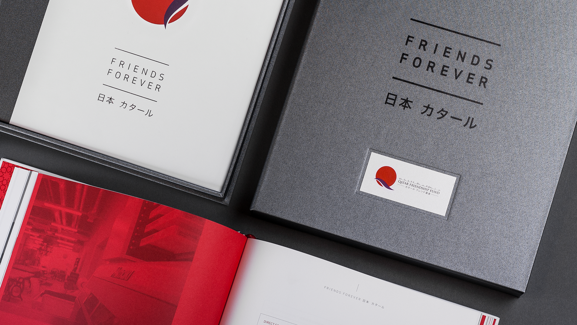
THE SOLUTION
Working with non-Latin characters presented a unique challenge as a non Japanese speaker, but I successfully overcame it to create a stunning physical tribute to the QFF’s relief efforts.
The result was a 148-page hardback book, housed in a premium case with foil and debossing elements on a buckram cover. The book features striking photography from the affected areas, highlighting the success of each project. I meticulously designed each spread, ensuring precise alignment to the grid for a consistent yet flexible layout. Key messaging and statistics were interleaved throughout the book, paired with monochrome text and imagery printed on premium Bright Red and Smoke G.F. Smith paper stock, symbolising the brand's identity and reflecting traditional Japanese colours.
I also developed the Friends Forever logo and identity, creating consistency across the identity and typographic choices throughout the design of the book.


