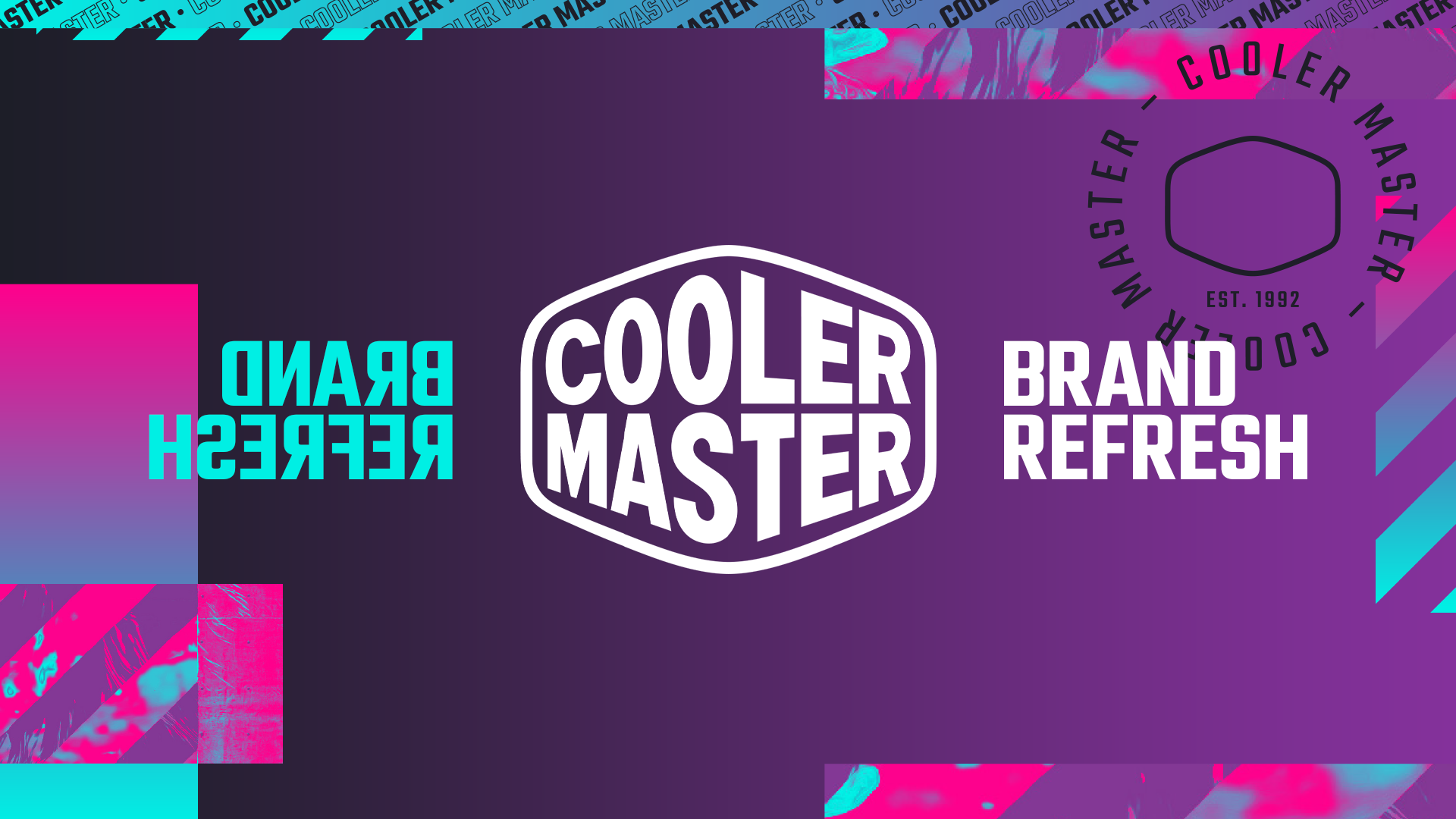
Cooler Master Brand Refresh
Brand refresh to appeal to the next generation PC fans
THE PROJECT
Cooler Master Technology Inc. is a computer hardware manufacturer based in Taipei, Taiwan. Founded in 1992, the company is well known in the world of PC customisation with a loyal following.
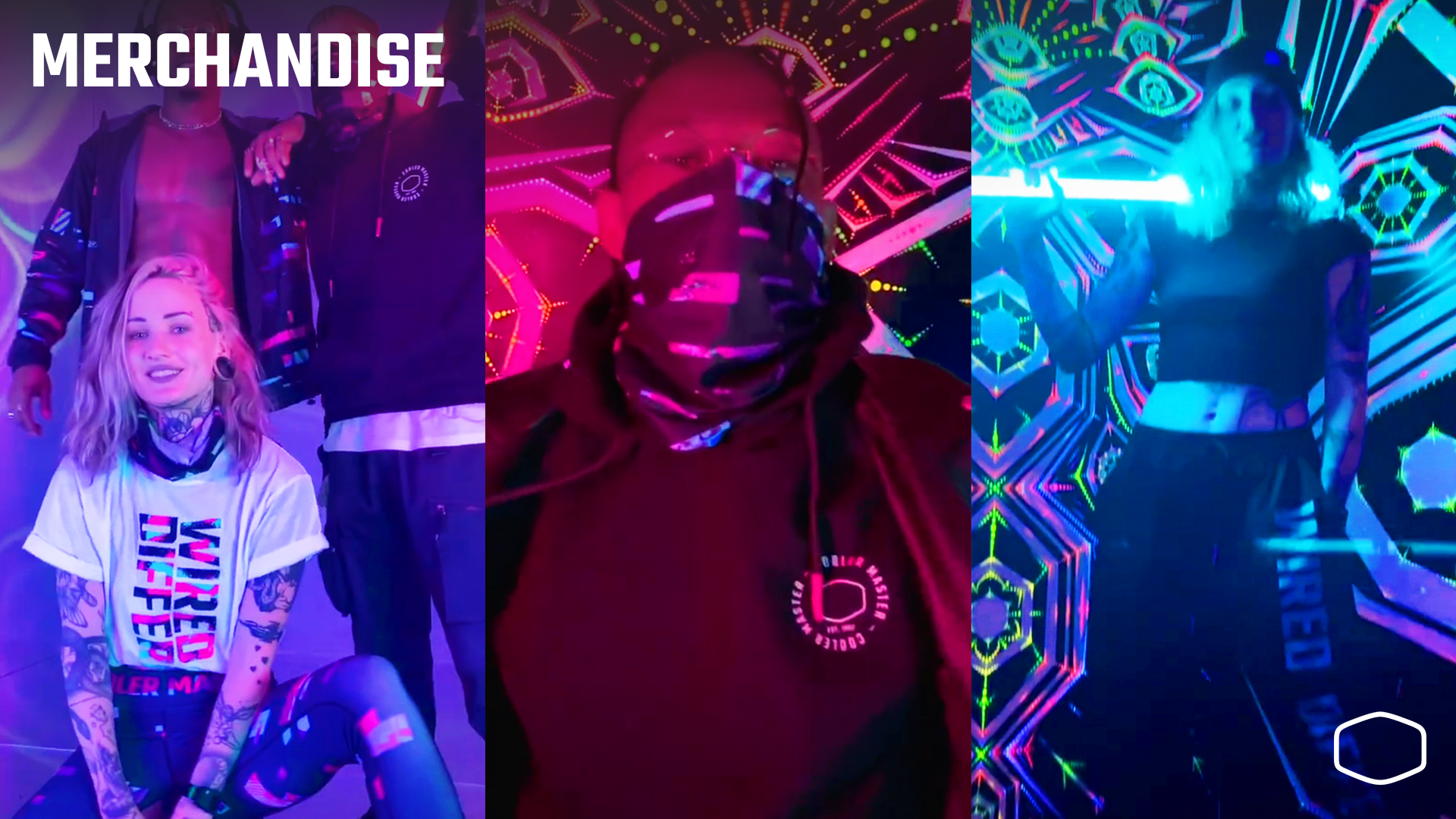
Cooler Master approached TAKEOFF to refresh their branding to appeal to the next generation of PC aficionados and gamers without alienating their core audience for their 30th anniversary. The brand evolution was a crucial part of the company’s new, broader approach to marketing.
Key skills:
Brand identity ۰ Typography ۰ Packaging ۰ Project Lead ۰ Client Workshops ۰ Client Liason ۰ Tagline Generation
Client: Cooler Master
Agency: TAKEOFF Studios

THE SOLUTION
Cooler Master’s logo was minimalist but instantly recognisable to the PC customisation community. We wanted to focus on keeping the most essential elements and assets, updating them in a way that felt more youthful and had a broad appeal.
As the Lead Creative, I hosted a deep dive session, performing detailed competitor and audience research to identify visual trends that would appeal to a younger, contemporary audience while keeping Cooler Master’s heritage intact. We explored audience profiles, brand and tone of voice, visual direction, typographic treatments, taglines, direction of graphic elements such as patterns and social campaign imagery. The output was used to create a new visual identity and brand guidelines, allowing the internal team at Cooler Master to create branded assets based on our guidance, such as the product packaging seen below.
As the campaign branding was during the height of Coivd-19, we also created a digital symposium for fans of the brand to explore the upcoming product launches.